Closed – Feature length article by Rachael Steven on legendary ‘art rock’ band Earl Brutus, and the lavish box set King designed for them

Creative Review magazine, 19 January 2016.
Earl Brutus was founded by Jamie Fry, Gordon King, Nick Sanderson, Stuart Boreman and Rob Marche in the early 1990s. The band released just two albums, and neither was a mainstream hit, but the group became something of a cult phenomenon.
Their music was inspired by the likes of Gary Glitter’s Glitter Band, Kraftwerk, and post-punk outfit The Fall – but with influences ranging from Wagner to Concorde, it was impossible to categorise. Tracks would feature stomping drums, glam rock-style guitar riffs, lyrics which read like a stream of consciousness or chants heard at a football ground.
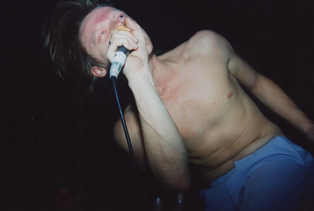
Gigs, too, were well known for their sense of chaos and theatre. There were props – from a funeral wreath which spelled out ‘Fuck Off’, to neon lights and a spinning garage forecourt sign which read ‘music’ on one side and ‘chips’ on the other – as well as smoke bombs, sound effects and a homemade aftershave machine pumping the scent of Earl Brutus (a cheap cologne) out into the audience. Band member Shinya Hayashida could often be seen head banging onstage, and shouting phrases like “nick someone’s pint and start a fight” at the audience.
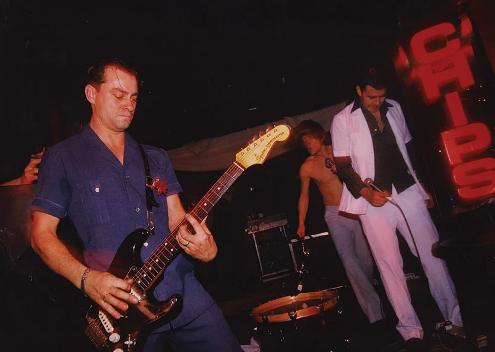
“The early shows were chaotic, never lasting more than about 20 minutes and usually ending in a big pile of broken equipment and beer bottles,” says Gordon King. “I used to trigger sound effects and bombs which I loved. Venues won’t allow them these days because of the fire risk.”
The cover for the band’s 1998 album, Tonight You Are The Special One, was designed by Scott King (his first of many collaborations with Earl Brutus), and featured a tragic yet striking image of two cars parked side by side, connected by hoses attached to each car’s exhaust pipe.
“The idea was something I’d been scribbling in notebooks for a while,” explains King. “It has the title I’ve Got a Window Wednesday, and was an idea I had for a sculpture – it was to be my first artwork should I ever become a ‘real artist’.
I used to live in Hackney, and every day I’d walk past this garage called Rude Mercs. It sold ‘bling’ for the Hackney boys to tart up their cars. It was, in its own way, very aspirational. These huge brightly-coloured, chrome covered Mercs all parked in the forecourt. I started to think about the people who might own these cars and one thought kept coming back to me – ‘I bet they would never kill themselves’ – these cars being so macho and somehow positive.
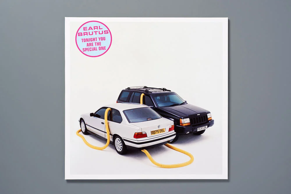
This thought metamorphisised, until eventually, it became a ‘yuppie suicide pact’ – two high-flyers who could no longer cope, make an appointment in their diaries to meet on a Wednesday lunchtime and end it all.
The cars we used for the shoot actually belonged two of the execs from Island Records, so that was nice. They were photographed beautifully by a fellow called Jack Daniels. It was, if I dare say, an instant classic – I knew it as soon as we looked at Jack’s transparencies on the light-box.”
The reverse of the sleeve featured an image of a custard cream – representing “work-stations, tea breaks, sick days – the banality of office life,” King says.
After 1998, Earl Brutus performed together less and less, and released their final single Larky in 1999. “We all needed to feed ourselves, so we got jobs,” says Gordon King. “Rob had left about a year earlier – I think he thought it had run its course – and we got our friend Martin Wright in on guitar, but without the support of a major label, the impetus was gone.”
Gordon King worked nights at a theatre, while Nick Sanderson trained to be a train driver.
The band’s last gig was at Hammersmith Working Men’s Club in 2004, where they performed at a concert to raise money for Ken Livingstone’s mayoral election campaign. (Fellow performer Frank Sidebottom almost died during the event after falling down a flight of stairs while wearing his famous papier mache head).
“There was always this idea that Earl Brutus would come back. That just never happened,” says Jamie Fry. Four years later, Sanderson sadly died of cancer aged just 47.
This month sees the release of a new box set which compiles all of Earl Brutus’ musical output in a lavish package designed by Scott King, with help from Rhys Atkinson. Beautifully produced by Daniel Mason at Something Else, the silk screen printed collector’s box is finished in silver glitter, and features a George Shaw painting of a flat roofed pub topped with a fluorescent orange sticker. Discs are also finished in glitter and feature words used on the forecourt signs at the band’s shows.
“I wanted it – as much as a box set can be – to be a fitting memorial,” King explains. “Not just to Nick Sanderson, but to the band and what they created. The box itself is an attempt to capture two sides of the band and a place that was hugely significant to Nick, Jim and Gordon: that is, early 1980s Sheffield.
They were there at this great time in the Sheffield music scene, with bands like Cabaret Voltaire, Human League, Clock DVA and ABC (Fry’s brother’s band). So, Earl Brutus were schooled at close quarters in early British electronic pop music – but of course it was in Sheffield – so you’ve also got this very ‘townie’, very normal ‘punch up in the pub’ culture. The band were really a composite of these two things, a kind of high-minded hooliganism,” he adds. “I was trying to get that across in the box design – mixing the effete glitter with the George Shaw painting of the flat-roofed estate pub on the cover. The glitter also relates to their love of Glam Rock and the eye-make up Nick used to wear on stage.”
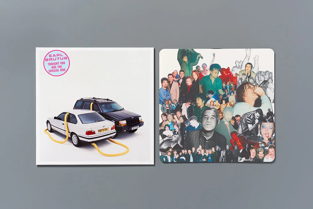
“With the collages, I wanted them to look like the kind of pin board you get at the end of the bar in a local pub,” says King. “Then I wanted this collage to contrast in the extreme with the tastefully designed, heavily foot-noted essay on the reverse. The whole idea for the packaging was to try and really capture the spirit of Earl Brutus – how complicated and artful they were, but also how boozy and chaotic and funny they were. [It] veers between hi-gloss, advertising slick, and cut-out snapshots on matt paper,” he adds.
Other features include a business card for Dave Mayhem, a fictional character with crap taste in music, dreamt up by the band. “Dave is a bit of a twat and generally has a substandard record collection,” says Fry. “He prefers The Alarm to The Clash, thinks Wet Wet Wet are better than The Four Tops and [his] favourite Bowie album is Black Tie White Noise. He changed his name to Mayhem to make life more interesting.”

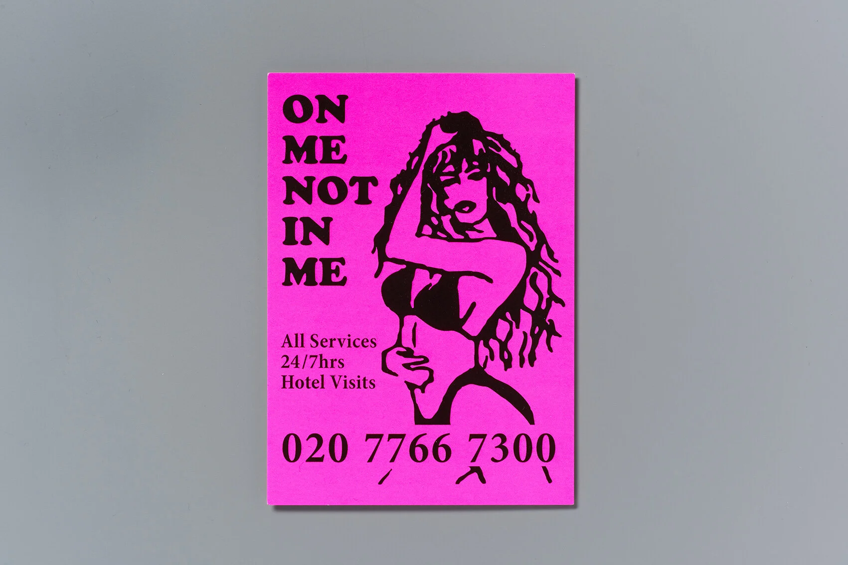
There’s also a calling card in the style of those once found in phone boxes around Soho (which the band used to collect). On Me Not In Me is the title of one of the band’s singles, and the phone number listed is the number for Buckingham Palace. On the reverse is a download code for Your Majesty… We Are Here.
Nu Brittanyia, an illustrated map designed by King for the new box set, depicts a vision of Britain where Earl Brutus is in charge – one where the Bank of England has been converted into a Wetherspoons pub called The Derek Griffiths, Inverness is named Trevor Bolder and the Forth Bridge has become an allotment.

“Nick had a fantastic imagination,” King says. “A very bitter comic vision of the world. He was obsessed with imprisoning Simon Cowell – either at this imaginary Gulag called Maidenhead B, or on the Isle of Wight at an unspecified location. Nu-Bryttania is me taking the spirit of Nick’s thinking and applying it to a new vision of Britain.”
The poster is laid out like a rail map, and its cover, when folded, features the British Rail logo in fluorescent orange, a symbol that was close to Sanderson’s heart. He once taped it onto his jumper using white gaffer tape before a gig, and Fry later had a friend sew a huge version of it on to a banner in glitter. “Trouble is, it was too big for the places we played at that time and was really only seen in all its glory after Nick died at his tribute gig,” Fry explains. “The logo will now always be in [his] honour.”
It’s been a labour of love for King, who first met Fry in 1992 after moving to London to work on i-D magazine. (Fry was a photographer at the time, and was commissioned by King to do some work for i-D).
“I had it in my head that this might be the last word on Earl Brutus – so it had to be perfect,” King says.
It’s rare to see such a lavish production nowadays – with glitter, stickers, posters and inserts – but it seems a fitting tribute for a band that combined high brow concepts with delightfully lo-fi imagery, and were once described as one of “the most original and uncompromising acts of their era” by Guardian critic Alex Petridis.
