Home Counties – King remembers the creative process and political climate that generated the cover concept for Saint Etienne’s ninth studio album

I have known Bob Stanley for a long time. I used to meet him in the Trevi café on Holloway Road. In early 2017, over breakfast, Bob wanted to ask me something. Saint Etienne were just putting the finishing touches to their new album. “It’s about England, Brexit, the home counties, that sort of thing,” he said.
I was waiting, fork in hand, grilled tomato mid-air. I was presuming he was building up to asking me if I wanted to design the sleeve. The conversation carried on, and eventually moved to the subject of George Shaw. Bob knew that I was friends with George, and he wanted to ask me a favour: “Do you think George would let us use one of the paintings for the sleeve? I love his work and it’s perfect”. I told Bob that he might, I wasn’t sure. I didn’t say, “Do you want me to design the sleeve?” – it seemed too vulgar, too pushy.
I spoke to George and he declined. Nothing against Saint Etienne, it’s just that too much of his work had appeared on book covers and record sleeves lately, and he didn’t want people to start to think he was an ‘illustrator’. I relayed the news to Bob, and he was disappointed.
A couple of weeks later, Bob emailed me, as if he’d been struck by a vision. “I just had this idea. Maybe you could design the sleeve? I’d never thought of that.” I didn’t tell him that I had, and gladly accepted the offer.
I gave this sleeve a lot of thought, but in the end, I kept coming back to the same idea, and it was that the sleeve image would be the background to a story – it would be something to ruin. It was only because I knew Bob well that I could even say this to him – most bands would have told me to piss off.
So Bob and I met a few times over the following weeks; he had now elaborated and told me exactly what the album is about – it’s a lament, a lament for the innocent England of his youth. Of course, it’s not quite that simple – it’s a critique of that too – it’s a question - a question framed by Brexit: ‘How did that lead to this?’
Bob and I met up again. He now had some images that he liked: one stood out, it was perfect – a picture of 17 Hartswood Avenue, Reigate, Surrey. A post-war suburban semi, and most importantly, Bob’s childhood home. This was now personal, it was fantastic. I explained that I wanted to cover the image in stickers.
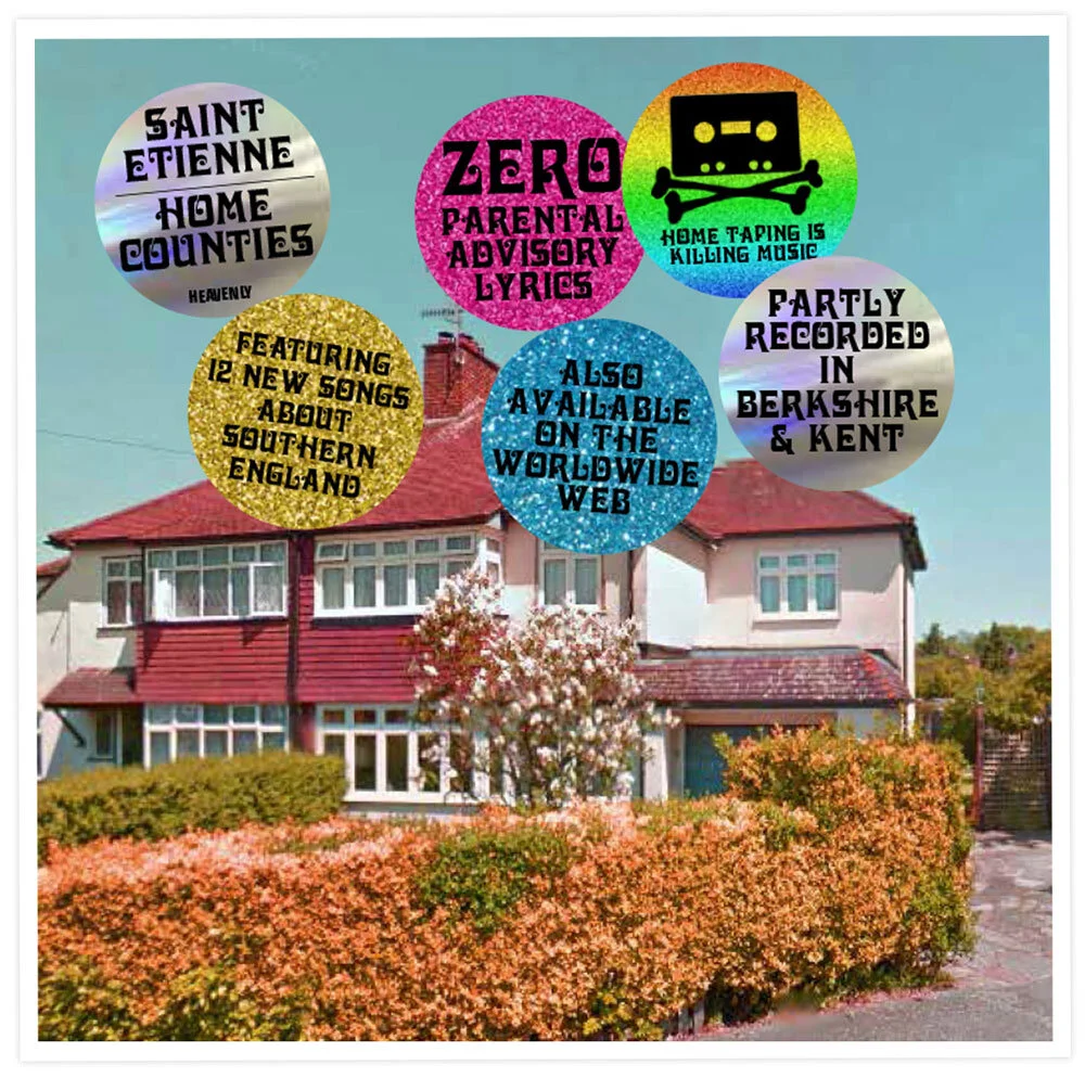
Early mock-up of Home Counties album cover.
I told him my story: “I imagine an over-zealous marketing man at your record company. He’s worried the record might not sell – he’s worried he might lose his job. So, we deliver the sleeve to him. We use this great house picture, tell him how much it means to you – I do my best to make it look great – we saturate the colours, make it like an old postcard, make it look like the most appealing kind of nostalgia. We use the font you like, really small for the band name – real ‘graphic designy’ on top of the sleeve. Then we hand it over to the imaginary marketing man – and he is appalled. He is fucking furious in fact – ‘could anything be less sexy than a post war semi?’. He berates us as we stand in his office. He kicks his desk and kicks us out. But we agree to disagree and he reluctantly accepts the artwork – THEN – in our absence, he has dozens of hype stickers made… He covers the sleeve in information that he thinks will help sell the record… he ruins our work.”
We both laughed, which I took as a good sign. It was Bob who said, “He makes a right mess of it.” He thought for a minute. “A big sticker saying THIS IS A SAINT ETIENNE RECORD”. I chipped in, “LARGELY RECORDED IN BERKSHIRE AND KENT”, to which Bob added, “BLACK VINYL… that kind of stuff.”
And with that I had license to just get on with it – Scott King